Button
A button is a clickable element which draws attention to a call to action and gives users a clear indication of what will happen when they click or tap. Button styles can be applied to links under our CTA component or can be embedded as buttons within form components.
When to use
- Buttons should be used when you are performing an action, such as: “submit,” “search,” etc.
- Links can be styled as buttons to highlight prioritized calls to action
When not to use
- Use links styled as buttons sparingly, they should align to a content strategy hierarchy and only be used on the most important calls to action
Anatomy
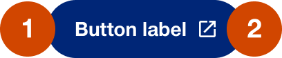
- Label: use a concise but clear description of what action the button initiates and should always be written in sentence case
- Off-site icon: any button that links off-site should have the off-site link (open in a new window) and the off-site icon should appear on the button
Demos & variations
Primary
AEM style: Blue button
The primary button indicates the most important action within a page or view. Avoid using multiple primary buttons on a single page, or within a single view. Including more than one main call to action on a page reduces the impact and makes it harder for users to know what to do next. There may be exceptions on certain pages, like a homepage, but it is not an ideal practice.
Primary inverse
AEM style: White button
The primary inverse button should be used as the primary button on designs utilizing a blue background for banner, sticky banner, full-width split banner and full-width banner.
Secondary
AEM style: White button - Blue border
The secondary button indicates medium importance. It should be used when multiple calls-to-action of similar importance are required within a page or view, or if this button type fits better within the context.
- The secondary button has a white background to ensure visibility on background colors and images.
- The secondary button should be used if a primary action already exists on the page or if it is necessary to have many buttons on one page.
- The secondary button can be paired with the primary button when you are trying to communicate the relative importance of the primary button.
Secondary inverse
AEM style: Blue button - White border
The secondary inverse button should be used as the secondary button on designs utilizing a blue background for banner, sticky banner, full-width split banner and full-width banner.
High impact button
AEM style: Orange button
The high impact button should be used sparingly, and only to drive actions of the highest importance to both the user and the business.
- High impact buttons are a great option for ad campaign landing pages where there is only 1 immediate goal for the page.
- The high impact button should only be placed on a white or light gray background. It should never appear on a light or dark blue background.
Full-width buttons
All button variations have the option to go full-width in tablet and mobile or only in mobile.
Arrow icon
All button variations have the option to use an arrow icon to the right of the label for landing page experiences.
Placement
Buttons will stack vertically by default but can be placed side-by-side utilizing the container for floating content in AEM.
When to show offsite icon
Internal links will be anything with the UnitedHeatlhcare brand. When a user clicks the link their journey stays within the same browser tab. External links will be anything that is not on uhc.com or is not branded UHC or UHG. An external link is denoted with an offsite icon that opens in a new tab when a user clicks the link.
URL / Property |
Internal or External? |
| Shop: uhone, SBS, exchange | Internal |
| Sign in: myuhc, member.uhc.com, HSID, unitedservices, myuhcvision | Internal |
| UHC sites: uhcprovider, uhcdental.com, uhcsafetrip.com, rmhp.com | Internal |
| UHC sites: uhg.com, UHCCF, careers.uhg.com | Internal |
| Optum sites: OptumRx, LAWW, Optumbank | External: would show offsite icon and open in a new tab |
| Rally: find a doctor | Internal |
| Language sites | Internal |
| Non UnitedHealthcare URLs: CDC, Mayo clinic, etc. | External: would show offsite icon and open in a new tab |
| PDFs, Apps, and other file types | External: would show offsite icon and open in a new tab |
| Social media properties | External: would NOT show offsite icon, the logo and link destination is sufficient |
Behaviors
Mouse
Users can trigger a button by clicking on it.
Keyboard
Users can navigate to a button by pressing Tab and Shift-Tab. Users can trigger a button by pressing Enter when the element has focus.
Content
Button text should be unique and descriptive. The purpose should be part of the link text. For example, instead of "Sign up", use "Sign up for basic service".