Sign in
The sign in pattern provides a consistent module to display sign in calls to action on pages to help members recognize there are options for singing in to get additional content.
When to use
- When there is additional content available in authenticated member experience
When not to use
- Do not use in the global header or footer
Anatomy
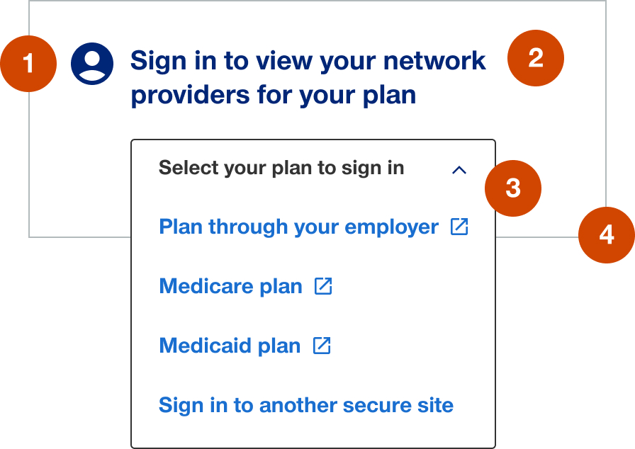
- Utility icon: 30px
- Heading: customizable to contextual needs
- Call to action:
- secondary button when providing a single sign in link
- menu when proving multiple sign in links to different authenticated member sites
- Container: white background with 1px solid border
Demos & variations
Single sign in link
Multiple sign in links to different authenticated member sites
Tablet and mobile
Historically this pattern has been hidden in tablet and mobile. In the future if a need arises to use in responsive layouts then the width on tablet should be no less than 50% and in mobile the pattern should be full-width.