Container
Used to group other components and apply a common style or layout. Similar to the Content With Background component, but is better utilized for layouts that are full width and need more variable padding.
When to use
- To create a common layout of grouped components
- To add border or background color to grouped components to highlight important information or actions on a page
- For layouts that need more variable padding
- For full width layouts
When not to use
- Avoid for layouts utilizing images that need to fit to the edge of the container and consider using content with background component instead
- Overuse of the component can overwhelm users and dilute the important information on a page
Anatomy
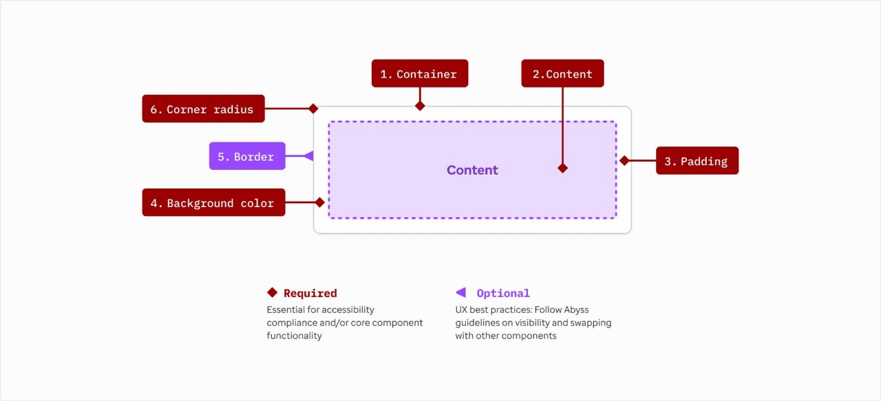
- Container: Holds content
- Content: Main content area for text, media, CTAs, or other components
- Padding (vertical & horizontal): 10px, 20px, 30px, 40px
- Background color: White; Bright blue 10%; Gray 2; Dark blue
- Border options for white containers: decorative solid border; decorative dashed border; optional left or right border
- Corner radius: 0px; 12px
Color usage recommendations
- Bright blue 10% background
Use for higher priority content and calls to action
- Off-white background
Use as alternative to bright blue 10% background - Gray 2 background
Use for supplemental or related content or calls to action Note: we generally try not to use the gray
- White background with solid border
Use for member content or calls to action
- White background with dashed border
Use for definitions and learn content
Additional recommendations
- Containers should always include a heading
Use H2 or H3 and limit to a maximum of 2 lines - Keep it simple
Content should be concise and provide a snapshot or brief overview - Padding (horizontal and vertical)
Typically 30px or 20px - Default component bottom margin
- No last child bottom spacing
Layout
2 content blocks within single container

50/50

33/33/33

25/25/25/25

Alignment options
Content aligned to top - default selection

Content aligned to vertical center

Vertical border
Optional left or right border to help separate 2 or more messages that are in-line with each other. The border is always hidden in mobile and has the option to also hide in tablet. Only difference between left or right is a personal style or authoring preference.

Additional layout configurations
There are additional column configurations if a container component is used within the column grid component.
Other container components in AEM
- Layout containers: these are built in at a root page template level and allow placement for general components
- Container for floating content: this is used to help create centered and side-by-side content in layouts
- Container for quick link card: only available in full width page templates, this allows placing quick link cards in a uniform way with the correct responsive spacing and behaviors
- Form containers: these are used to build forms using form components outside of AEM
Related elements
Examples
These are intended as examples of individual container styles and content groupings. For design recommendations when grouping multiple containers together, please see additional examples in the uhc.com DPL Figma file.

Heading 2
Lorem ipsum dolor sit amet, consectetur adipiscing elit, sed do eiusmod tempor incididunt ut labore et dolore magna aliqua. Ut enim ad minim veniam, quis nostrud exercitation ullamco laboris nisi ut aliquip ex ea commodo consequat.2

Heading 2
Lorem ipsum dolor sit amet, consectetur adipiscing elit, sed do eiusmod tempor incididunt ut labore et dolore magna aliqua. Ut enim ad minim veniam, quis nostrud exercitation ullamco laboris nisi ut aliquip ex ea commodo consequat.2
Heading 2
Lorem ipsum dolor sit amet, consectetur adipiscing elit, sed do eiusmod tempor incididunt ut labore et dolore magna aliqua. Ut enim ad minim veniam, quis nostrud exercitation ullamco laboris nisi ut aliquip ex ea commodo consequat.2

Heading 2
Lorem ipsum dolor sit amet, consectetur adipiscing elit, sed do eiusmod tempor incididunt ut labore et dolore magna aliqua. Ut enim ad minim veniam, quis nostrud exercitation ullamco laboris nisi ut aliquip ex ea commodo consequat.2