
Header: Microsite
Our microsite header appears across the top of all pages on a microsite; it contains the site logo and main navigation and an optional secondary header. CTAs such as links, buttons, flyouts, dropdowns, and language toggles can all be added depending on the use case.
When to use
- Building out landing page or paid media campaign pages
When not to use
- On uhc.com proper
Main header
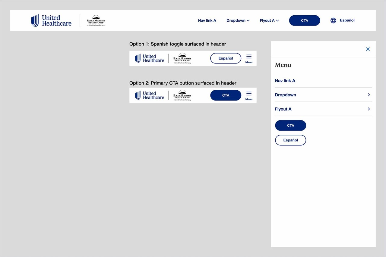
The main header is a required part of the Microsite Header component. A logo is required within the main header but a co-logo is optional depending on use case. Up to five navigation items can be placed within the main desktop header including links, dropdown link, flyout link, button, Spanish toggle.
Anatomy
Desktop
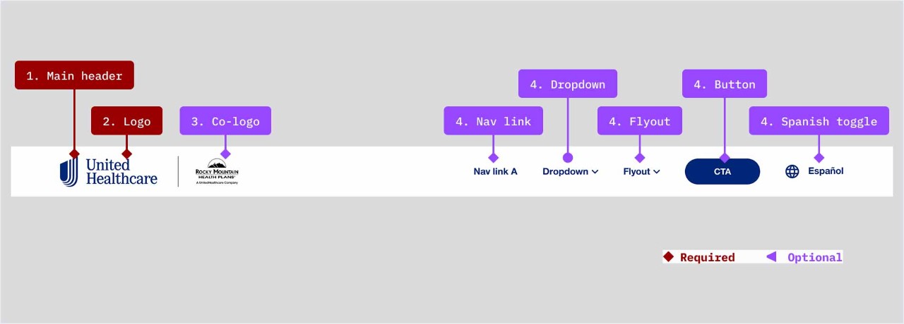
- Main header: required
- Logo: required but may be a UMark or lockup depending on use case
- Co-logo: optional depending on use case
- Navigation items: Up to five navigation items may be displayed (if more items are needed, the secondary header will need to be displayed)
- Navigation links
- Dropdown
- Flyout
- Primary or secondary button (one button max in the header)
- Spanish toggle
Mobile header (see Demos & Variations for menu drawer examples)
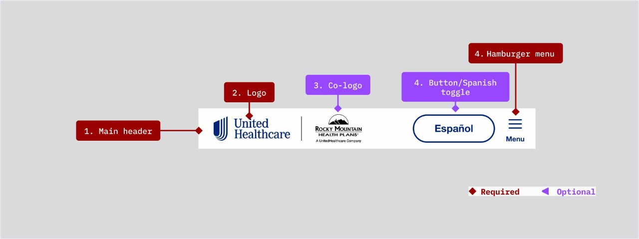
- Main header: required
- Logo: required but may be a UMark or lockup depending on use case
- Co-logo: optional depending on use case
- Navigation items: Up to two navigation items may be displayed
- Button - One button may be displayed either primary or secondary (including the Spanish toggle styled as a secondary button)
- Hamburger menu (required)
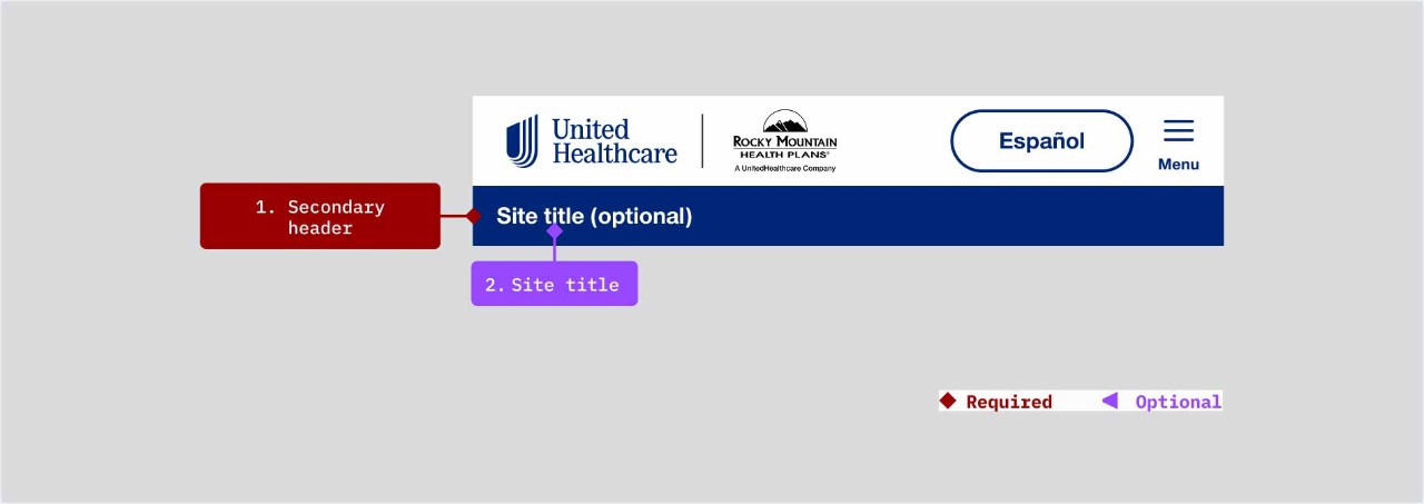
Secondary header
If the number of navigation items on desktop is greater than five, the secondary header will be required. Mobile views do not have a secondary header options (see Demos & Variations section for examples).
Anatomy
Desktop
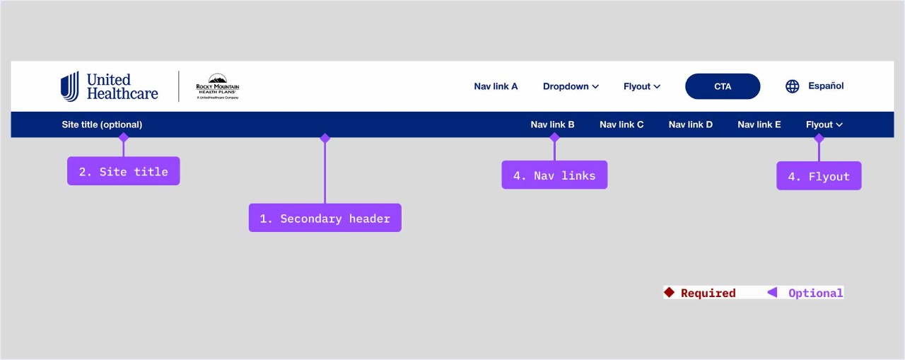
- Secondary header: required if the main header has more than five navigation items
- Site title: optional
- Navigation items: Up to five navigation items may be displayed
- Navigation links
- Flyout link
Anatomy
Mobile
- Secondary header: required if the main header has more than five navigation items
- Site title: optional
- Navigation items: Up to five navigation items may be displayed
- Navigation links
- Flyout link
Demos & Variations
If the number of navigation items on desktop is greater than five, the secondary header will be required. Mobile views do not have a secondary header options (see Demos & Variations section for examples).
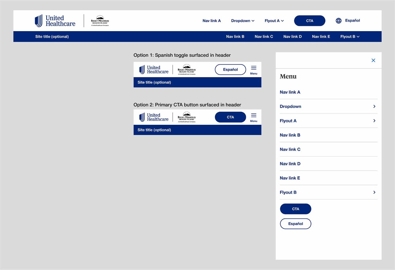
Primary header example shown in desktop and mobile
Primary header with secondary header example shown in desktop and mobile