Full-width banner
The full-width banner, also referred to as the hero banner, is a high-impact, one column component that may be used at the top of the homepage or campaign landing pages. Use this component to capture the user's attention, bring compelling imagery to your message and support the primary message of the page.
When to use
- At the top of the homepage or campaign landing pages
- To capture the user’s attention, bring compelling imagery to your message and support the primary message of the page
When not to use
- On lower level landing and content pages
Anatomy
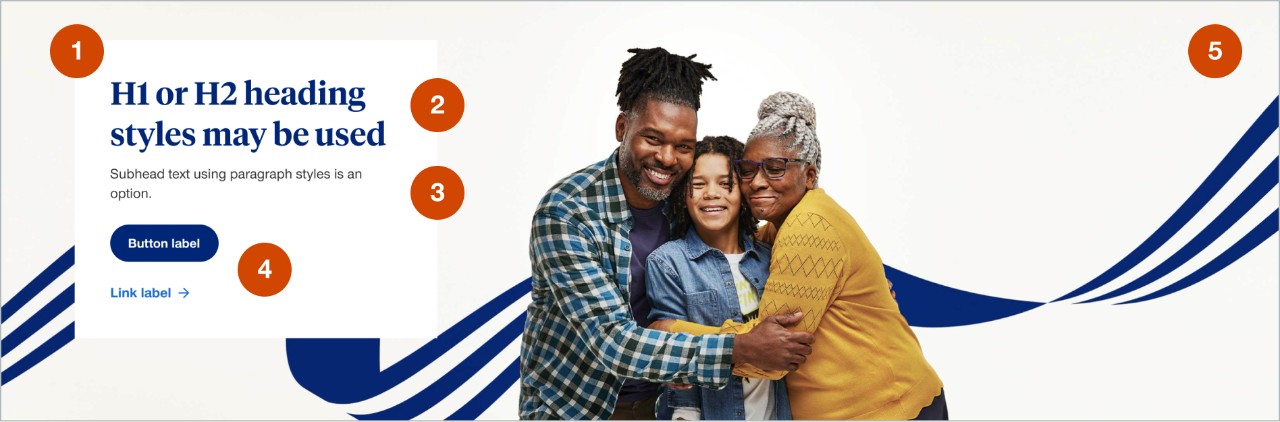
- Content box:
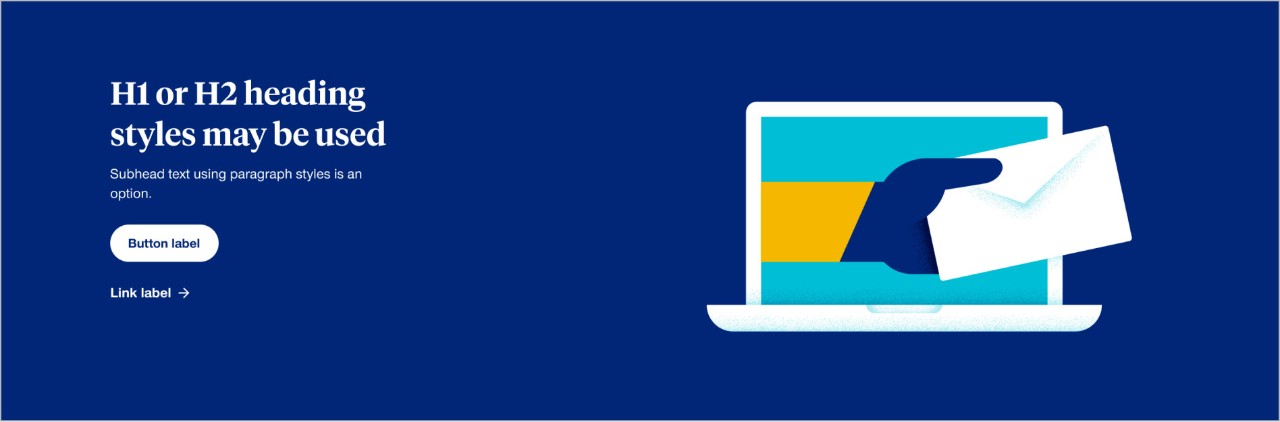
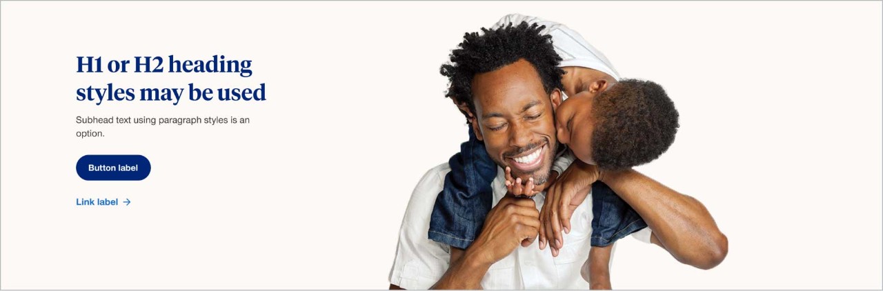
- this can have a white, off-white or blue background color
- only utilize the blue background when paired with a brand illustration
- option to be a larger width when more copy and content is needed
- option to be left or right aligned
- Heading styles: use H1 or H2 heading styles and limit headings to a maximum of 3 lines
- Paragraph/Subhead text: subhead text is optional and should be limited to a maximum of 3 lines in length
- CTA: optional to include a button, link or zip finder. Only one CTA should be used in the banner to increase the impact and importance of the action a user should take
- Image: an image is required and may be a photograph or brand illustration
Demos & variations
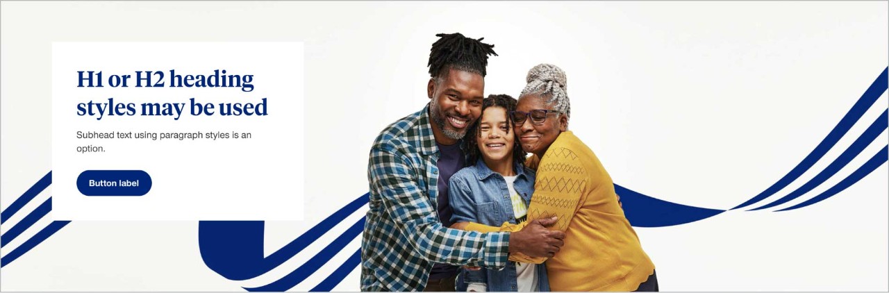
Full-width banner with left alignment
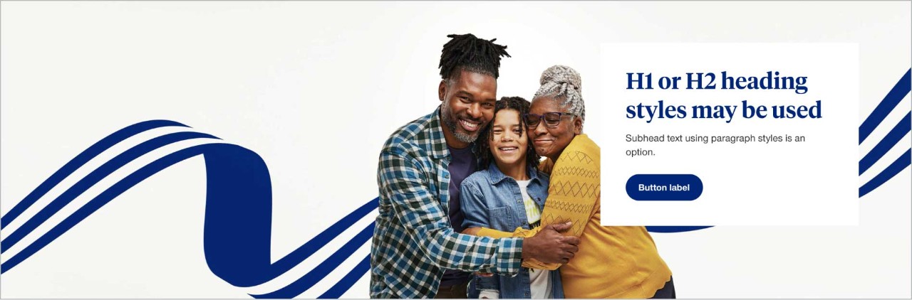
Full-width banner with right alignment
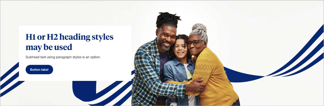
Full-width banner with large content box
Full-width banner with blue content box for illustrations
Full-width banner with off-white content box
In tablet and mobile it switches to default white background.
Placement
Full-width banners should be placed right below the global header.
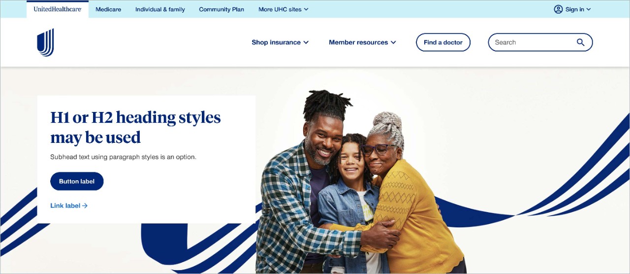
Image specs
Images should be provided at 2x size so they appear sharp on retina monitors. The sizes below are recommended, but the height of the banner may be adjusted if necessary. See more guidance on the image component page.
Component image height
Avoid making the banner height larger than 500px to avoid pushing supporting content too far down the page.
Desktop: Author the image height as 475px
Tablet: Author the image height as 350px
Mobile: Author the image height as 280px
Asset image size
All image assets MUST be optimized for the web. It is preferred that images are 350kb or less in size.
Desktop: 1920 x 543px (2x image size 3840 x 1086px)
Tablet: 768 x 350px (2x image size 1536 x 700px)
Mobile: 500 x 280px (2x image size 1000 x 560px)
Image file size: 350kb or less
Preferred file type: jpg (the component can support .png or .gif files)
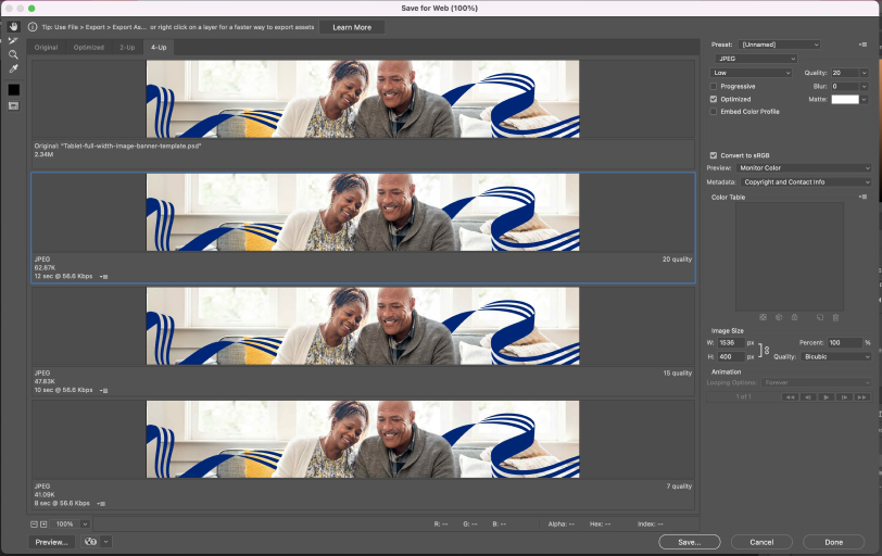
Photoshop settings
Create your image at 2x in Photoshop. And then go to File > Export > Save for Web (Legacy)
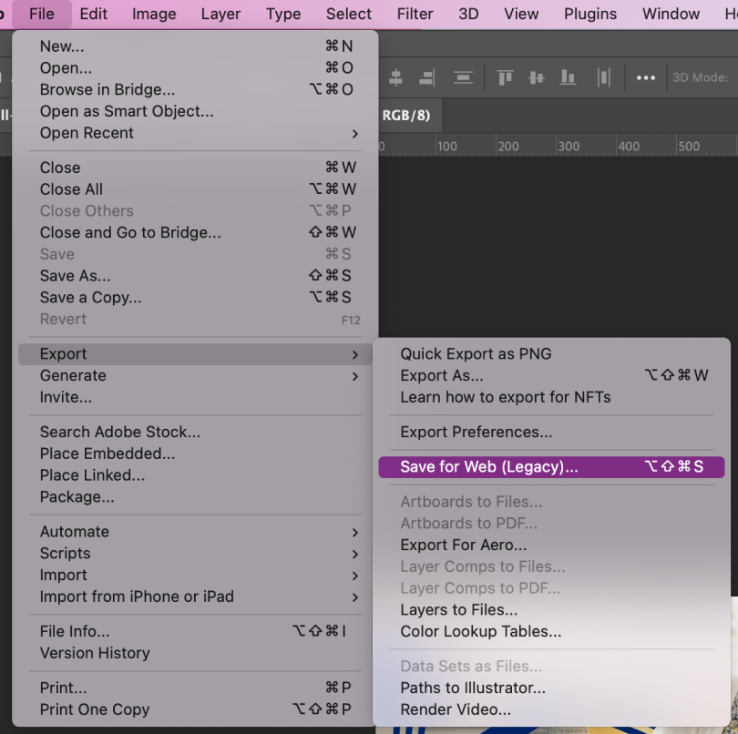
Select JPEG, Enter Quality: 20. Hit Save.
File naming convention best practices
When naming photography always include
- descriptive information about what page the image is on and what is in the image
- the word "mobile" or "tablet" at the end of the file name if the image is viewport specific
- use the word "full" at the end of the file name if the image is intended for use on the hero banner or full-width image component
- image dimensions
- separate words by dashes (not underscores)
- full words
- lowercase
File name examples
- image-descriptor-size-mobile.jpg
- empowering-dad-daughter-500x200.jpg
- empowering-health-dad-daughter-500x100-mobile.jpg
File names should not have any spaces or capital letters.