Form elements
These are the form elements currently available to use to build form components. Form elements are not available individually in AEM and must be built within a unique form component.
When to use
- For building form components
When not to use
- For individual or one-off use
Demos & variations
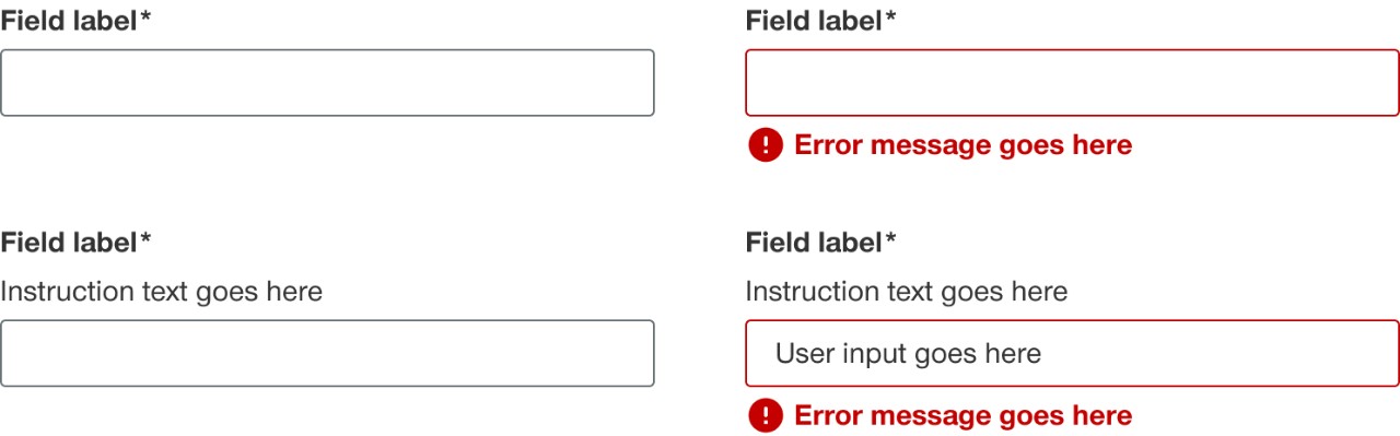
Label and helper text
The label generally appears above the form element and provides a brief description of what the user should input. A label can be hidden if it is still programmatically read by a screen reader if needed but is not highly recommended. If a form element is required the label will have an asterisks next to it to denote to the user that it needs to be filled in to be able to submit the form. Optional to include helper text underneath the label to provide further instruction to the user. Don’t use punctuation in helper text unless it’s multiple sentences long.
Email address*
Helper text would go here
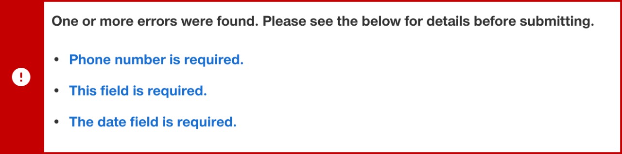
Page level error validation
Page level error validation should show after a user submits a form and it comes back with one or more errors or if the form has an API or loading error.
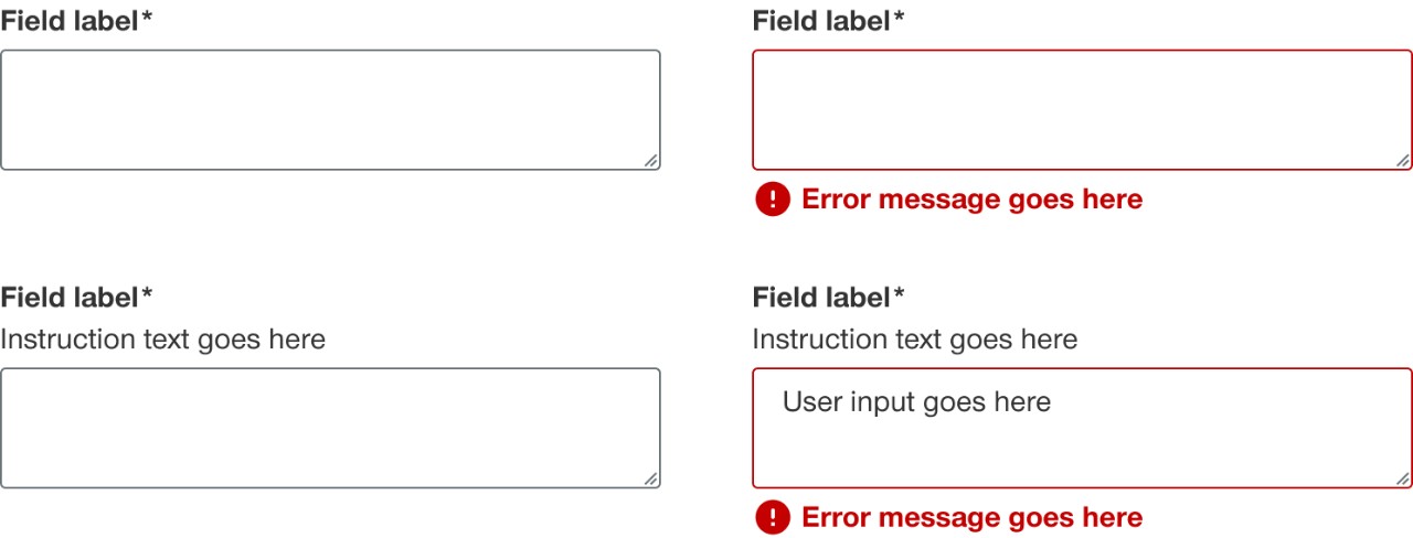
Inline form field validation
Inline form field validation appears directly below a form field element after a user fills in the field incorrectly or leaves a required field blank.

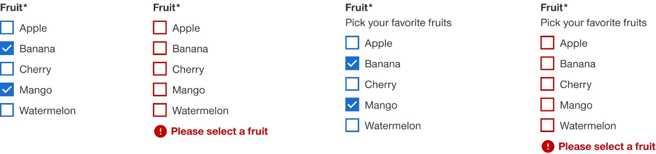
Checkboxes
Checkboxes should be used when a user can select multiple items from a list.
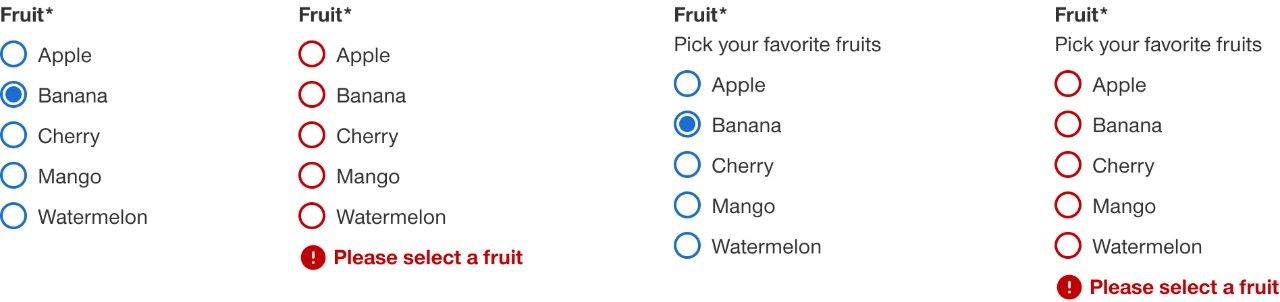
Radio buttons
Radio buttons should be used when a user can only select one item from a list.
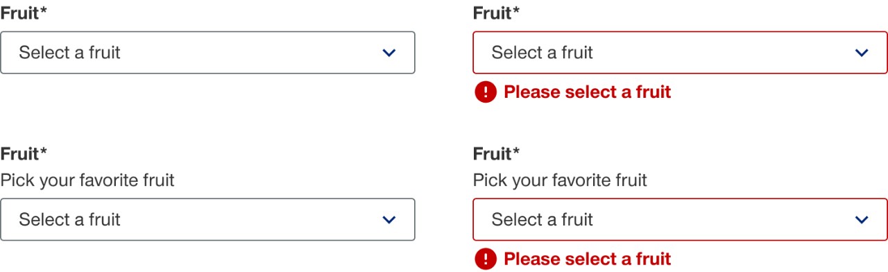
Select input
Select input is a collapsed and scrollable list of predefined options for the user to chose from. When a user clicks on the input an overflow menu of items appears. A user can only select a single item and after selecting an option the menu collapses and shows the selected item in the input. For lists longer than 10 items consider using the combo box component.
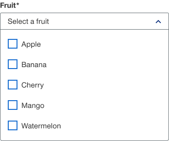
Multi-select input
Multi-select input is similar to the select input but a user can select multiple items using the checkbox functionality. For lists longer than 10 items consider using the combo box component.
Text input
Text input accepts a single line of text.
Text area input
Text area input accepts multiple lines of text.