Quick link cards
Quick link cards are for call to actions on landing page experiences that need to highlight additional navigation or cross linking opportunities, usually on full width landing page experiences. Quick link cards should have two or more related call to actions that will display in a row.
When to use
To highlight additional navigation or cross linking opportunities
When not to use
- For single standalone call to actions
- Inline or after long form content
Anatomy
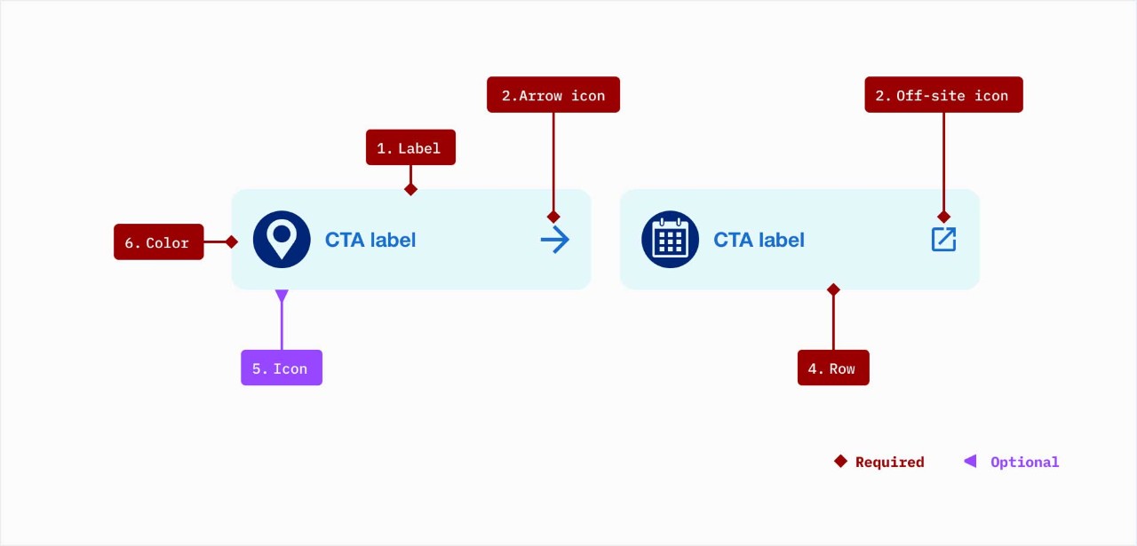
- Label: use a concise but clear description of what action the card initiates and should always be written in title case
- Utility icon (arrow or off-site): Arrow is used for any link that isn’t marked as off-site; Off-site use for links that open in a new window
- Row: should display in a row with at least 2 or more cards included and are only available with bright blue 10% background color
- Icon: Optional 48px icon in any color variant
- Background color: choose between Bright Blue and Gray 2
Demos & variations
Inline layout
- Desktop can only be displayed with the inline layout
- Tablet may use inline or stacked layout (see below)
- Mobile does not have the inline layout option
- Padding: 24px
Minimum 2-up
3-up
4-up
Recommend maximum 5-up
Stacked layout (tablet and mobile only)
- Tablet may use inline or stacked layout
- Mobile only has a stacked option
- Padding between cards is set at 24px
Authoring notes
To utilize quick link cards you will have to first place the container for quick link cards component.

Behaviors
Mouse
Users can click on the entire card to trigger the call to action.
Keyboard
Users can navigate between cards by pressing Tab and Shift-Tab. Users can trigger the call to action by pressing enter.