Icon block
Icon block offers a way to highlight content and create aesthetic variation within a layout. It should be used whenever an icon is next to content to support layout consistency across pages. The icon block pattern is meant to be super flexible and has a large variation of ways it can be utilized within other patterns.
This pattern should not carry the primary message of the page and should be used in supportive or secondary messaging.
When to use
- Whenever an icon is placed next to content to support layout consistency
- Supportive messaging that needs aesthetic variation
When not to use
- For primary messaging or with <h1> tags
- With text-only
- With imagery or brand illustrations
Anatomy
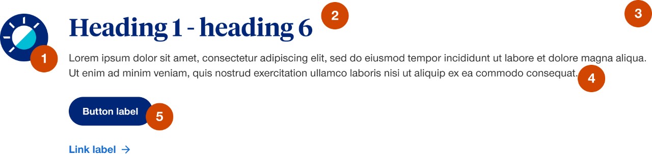
- Icon: choose from large (70px), medium (48px) or small (30px)
- Large icon is the default selection for this component
- Icon can be to the left of the content or stacked above
- When stacked above the content the icon can either be left or center aligned
- In mobile large and medium icons display at medium size
- Option to hide or change position of icon in mobile
- Heading: option to include heading
- Do not use <h1> tags with this component
- Container:
- minimum size of 3 columns width on a desktop and 6 columns width on mobile
- adopts background color of container it’s placed in
- Body copy: option to include descriptive or supportive text
- Call to action: option to include a variation of call to actions (e.g. buttons, links and TFN)
Demos & variations
Variations are shown with large icon size, but all variations are available with medium and small icons.
Icon alignment
Left aligned
Stacked and left aligned
Stacked and center aligned
Content variations
No call to action
Button only call to action
Link only call to action
Link and button call to action
Button and phone number call to action
Combo box as call to action
Link as heading
Link list that can be 1 - 4 columns (optional heading and body copy are hidden)
Vertical border
Optional left or right border to help separate 2 or more messages that are in-line with each other. The border is always hidden in mobile and has the option to also hide in tablet. Only difference between left or right is a personal style or authoring preference.
Smart icons
Brand has over 160 icons that each have 4 different versions, that’s over 640 icon files! To limit that many files in our system, we create smart icons to use in the icon components. We do this by embedding color classes for each icon variation into the SVG code of a single icon. Then an author can switch the icon variation easily within the styles panel of the icon block. Which means we only need to upload 1 file to get all 4 variations.