Sticky banner
The sticky banner should be used to emphasize and make the the primary message of a page easily accessible to the user as they interact with the content on the page. The sticky banner banner can also include related optional actions to the primary message.
When to use
- For persistent primary messaging
- For marketing, promotional or any conversion forward content
When not to use
- If there is already a sticky banner on the page or if there are competing primary messages on a page
- For informational messages that affect uhc consumers such as: national health or weather emergencies, phone lines being down and enrollment periods
- For system status or validation messages
- As a navigational menu
Anatomy
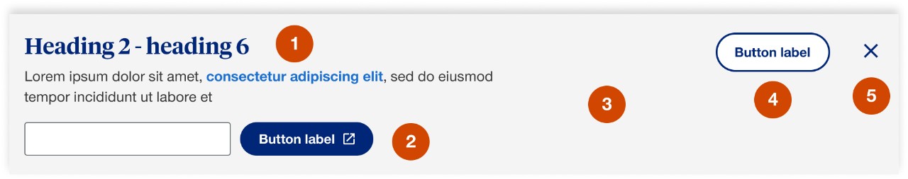
- Content: sticky banner should have either a heading or body copy
- Call to action: sticky banner is required to have 1 primary call to action that can either be stacked or side-by-side with the content, options include:
- plan finder
- button
- link
- toll-free number (TFN)
- plan finder
- Background color: options include white, gray 2, bright blue 10% and blue
- Secondary call to action: option to include a secondary call to action in support of the primary messaging, recommended for help or contact information
- Close button: recommended but optional to have a close button for user to be able to close the banner
- On a top placed sticky banner hitting the close button will only dismiss its sticky position and will still be available on the page
- On a bottom placed sticky banner hitting the close button will dismiss the banner completely for the user’s session
- On a top placed sticky banner hitting the close button will only dismiss its sticky position and will still be available on the page
Demos & variations
Zip finder CTA
Stacked

Side-by-side

Button CTA
Stacked

Side-by-side

Link CTA
Stacked

Side-by-side

Tablet and mobile
Sticky banner elements should be flexible to turn on and off between tablet and mobile to help optimize the height so that the user still has a reasonable scroll area. Testing and consideration will have to take place for each use case of the sticky banner to understand the ramifications of other sticky elements on uhc.com such as global header, smiley survey, etc.
Placement
Bottom
Sticky banner will be fixed to the bottom of the screen, this is best used for a persistent primary call to action that is not necessarily included in the page content. This can be used on any page layout.

Top
Sticky banner will appear within the page content and then once you reach its scroll position it will stick to the top of the browser. This is best used for primary call to actions that are on longer pages. This cannot be used with page layouts that include a left navigation.

Behaviors
Mouse
Users can interact with the sticky banner by clicking on any of the calls to actions included or the close button.
Keyboard
Users can navigate to the sticky banner in DOM order by pressing Tab and Shift-Tab. Users can trigger a CTA or action within the sticky banner by pressing Enter when the element has focus.
Content
- Messaging should be focused with a clear single call to action
- If footnotes are needed ensure that they are non-interactive and don’t include a tooltip by using the class <sup class=”non-tooltip”>