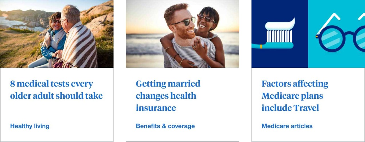
Article cards
An article card contains the headline and metadata about a single article. It acts as an entry point into an article and is a member of a collection of article cards and not a single card in isolation.
When to use
- To offer a short preview of article content that is linked to an article page
- Layout multiple sets of article cards of related information in the same area of the page
When not to use
- When displaying a menu or a list
- Only as a decorative element that doesn’t link to article pages
- Single card in isolation
Anatomy
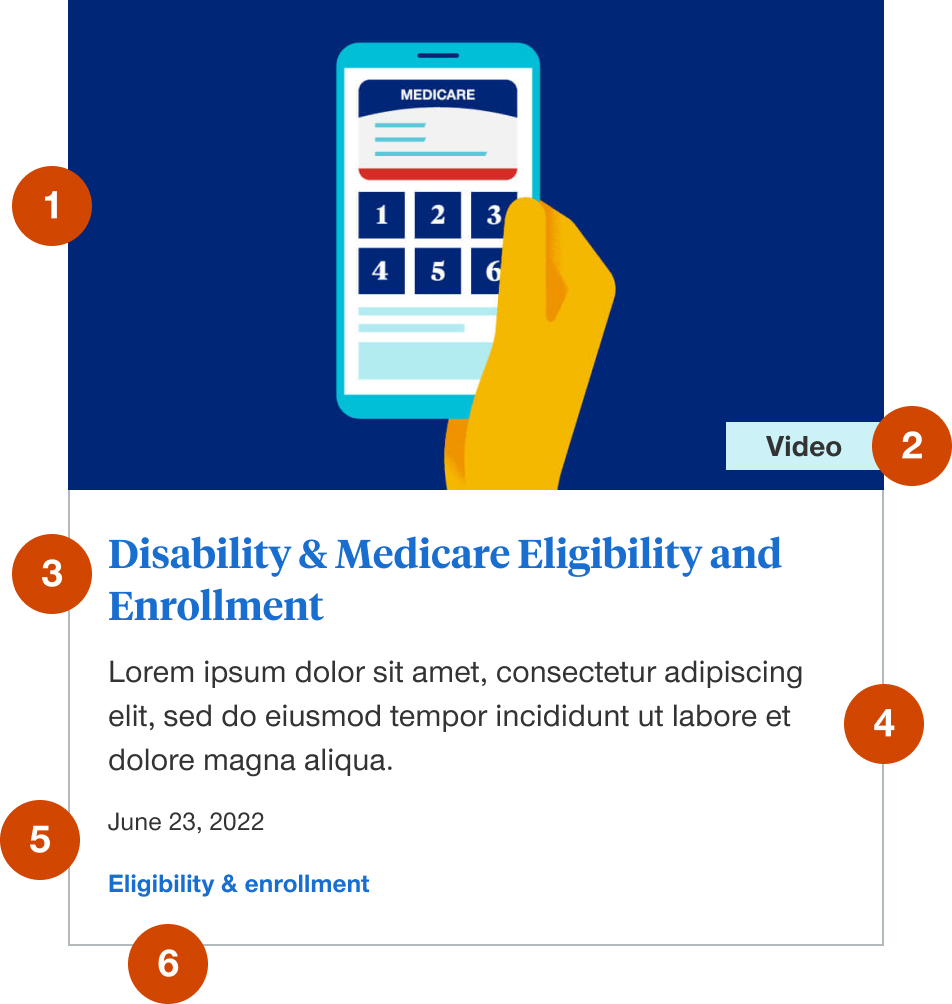
- Thumbnail image: required element to maintain layout integrity and consistency
- Video badge: optional element to denote video content
- Headline link: required element to link to article page
- Article description: optional element to include a brief description of the article
- Primary tag or facet: this is optional to display and is a link to the primary tag or facet category landing page
- Published date: this is optional to display and is not recommended for evergreen content
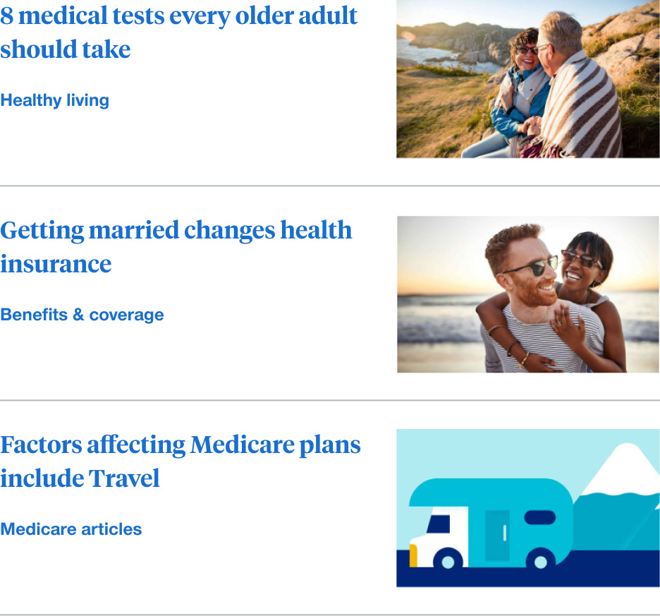
Images specs
Article card images typically utilize the main image of the article they are linked to and are cropped with CSS to uniformly fit into the article card component across screen sizes. Best practices to keep in mind when choosing photos for an article page and article card are:
- Landscape image aspect ratios are typically the best (3:2, 4:3, 16:9, etc.)
- Maximum file size should fall between recommendations for medium and thumbnail sized images or 200kb - 10kb
Demos & variations
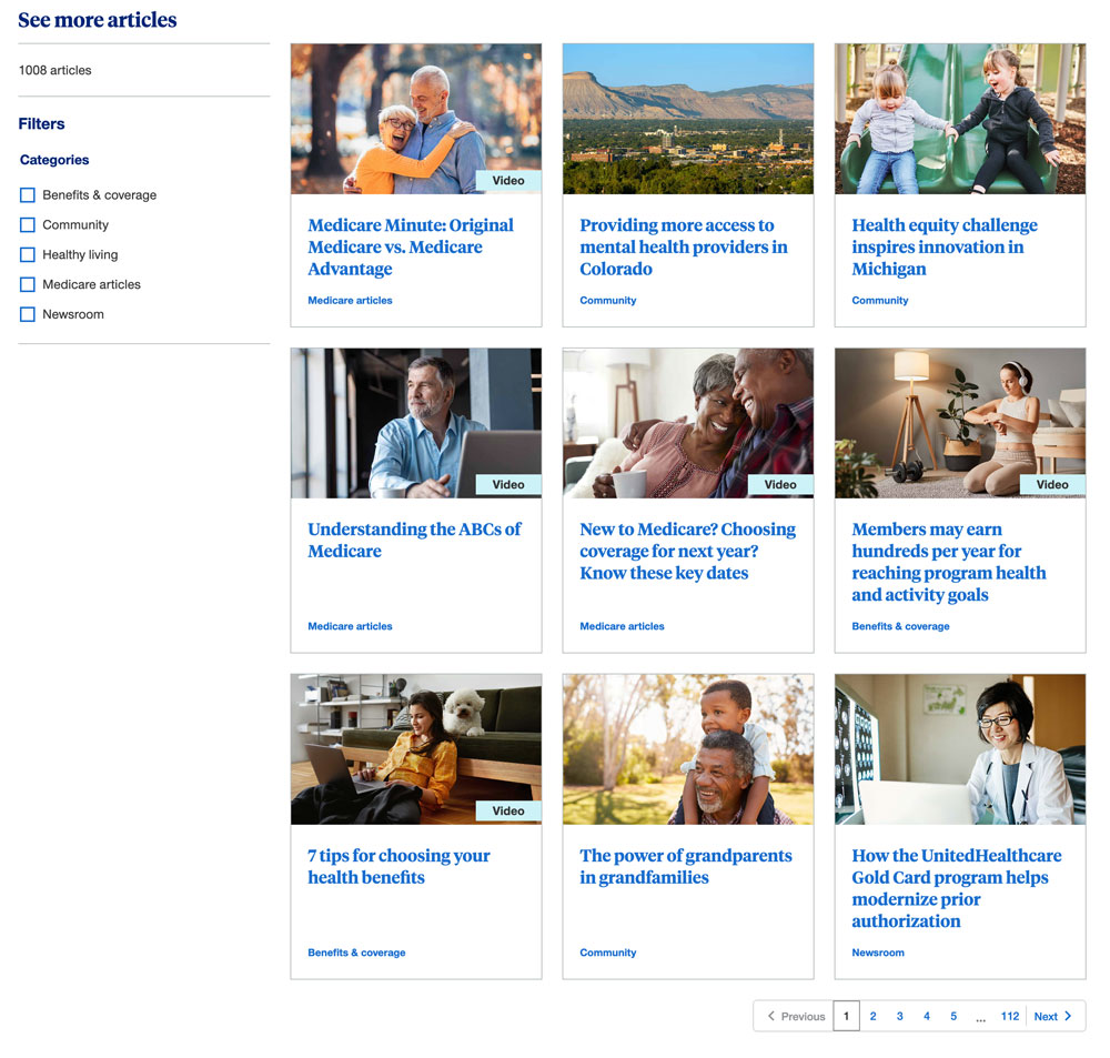
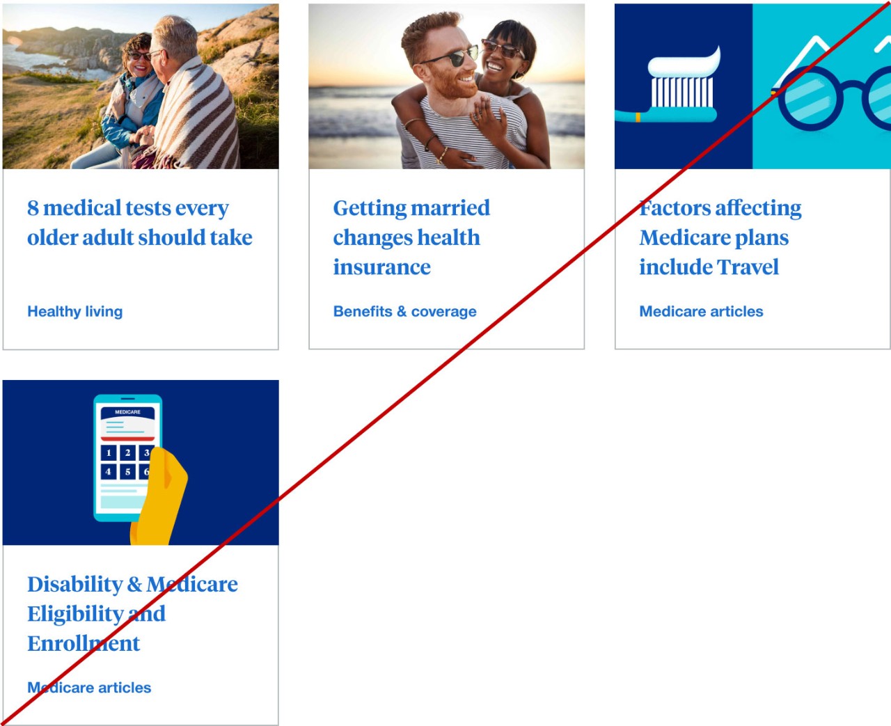
Row
Rows of article cards can be 3-up or 4-up in full width or left nav templates. Rows should maintain height of tallest card.
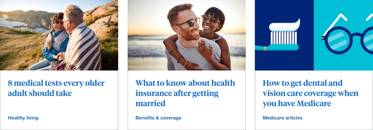
3-up in full width page layouts with filters
This layout is typically found on the UHC Health Matters™ landing page and subsequent category landing pages.
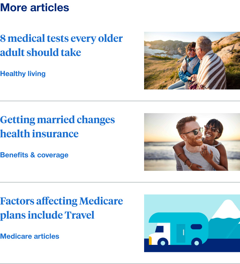
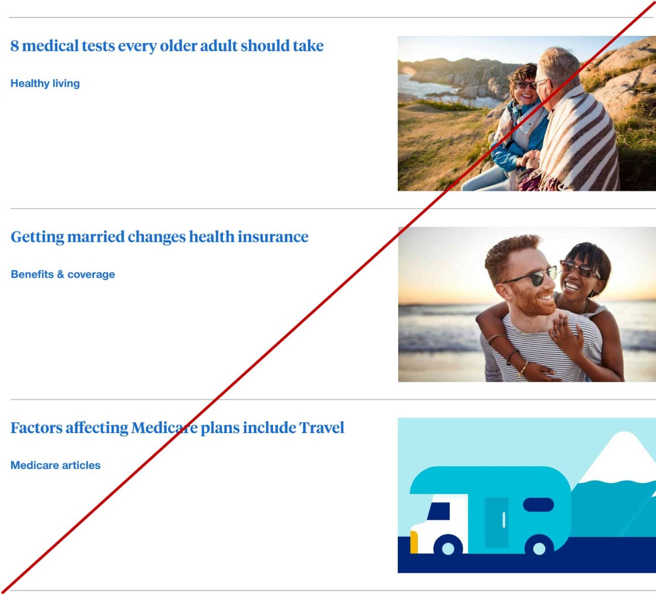
Right rail in blog article page layout
These are typically stacks of 2-3 article cards found in the right rail of the blog article page layout. These can be manually set or integrated with Adobe recommendations.
Tablet
Tablet behavior is consistent across variations and will only show rows divisible by 3.
For example if you have a row of 4-up in desktop then in tablet that would only display 3. This is to avoid over crowding or having a single article card on an additional row.
We do not put articles in a vertically stacked layout in tablet because it ends up being twice as high and results in a lot of dead space.
Mobile
Mobile behavior is consistent across variations and can show any number of article cards vertically stacked.
Behaviors
All headline links should link to their respective article page and primary tags or facets should link to their respective landing pages.
Mouse
Users can click on a headline link, primary tag or facet.
Keyboard
Users can navigate between headline links, primary tag or facet by pressing Tab and Shift-Tab. Users can trigger a headline link, primary tag or facet by pressing Enter when the element has focus.