Image
Images are a great way to add visual interest and enhance the brand experience for users. The image component can support medium images, thumbnail images and illustrations. These best practices are also good for use in other image-based components such as full-width image, full-width banner, etc. Photographs should be used throughout the site and adhere to brand standards.
When to use
-
For any medium or thumbnail image or illustration placed directly on a page
-
For reference and direction for images used within other components
When not to use
-
For icon placement consider using icon or icon block components
-
Best not to use images and illustrations within tables
Photography styles
Portraiture photography
Bring focus to the individual through clean warm white backdrops. Celebrate confidence, diversity and uniqueness with enhanced contrast.
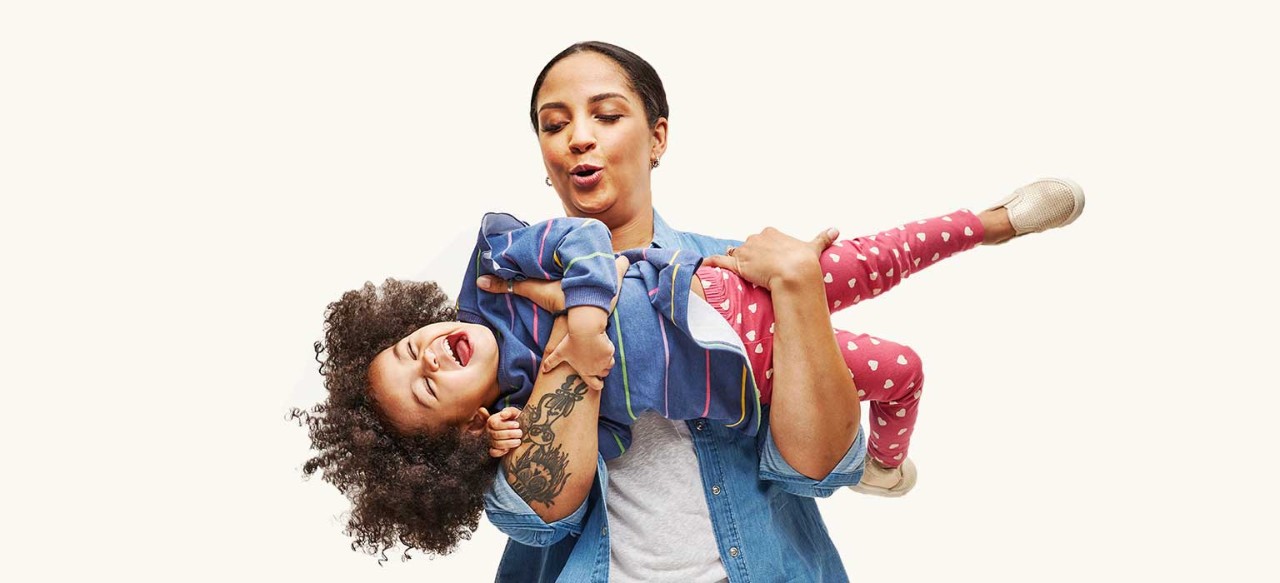
Situational photography
Capture stories, candid and relatable vignettes in realistic/lived-in and aspirational environments with dominantly warm white backdrops.

The Ribbon and photography
Embedding in portrait photography
The Ribbon can be integrated into portrait photography to make imagery distinctly ours. Embed The Ribbon in components that highlight an image as the hero and are considered a shop, common entry or paid media page. See the page layout page for more guidance.

Embedding in situational photography
Brand does not recommended using The Ribbon within situational photography. It’s acceptable to use existing assets with the legacy ribbon embedded in situational photos but going forward would like to deprecate that styling. If wanting to use The Ribbon assets with situational photos the preferred method is using the ribbon as a cropping device, the examples given in the brand center are printed materials so if considering this direction work closely with brand partners.
Image specs
- Accepted file types
- jpg (preferred)
- png
- gif
- svg
- Maximum file sizes
- Banner images: 350kb or less
- Medium images: 200kb or less
- Thumbnails: 10kb or less
- All assets should be delivered at 2x the image size to ensure they remain sharp on a retina monitor and optimized for web in Photoshop to ensure small file size for better performance
- For all assets a desktop and mobile version should be created
- Mobile assets should follow the standard 500 x 150px (2x @ 1000 x 300px)
Photoshop settings
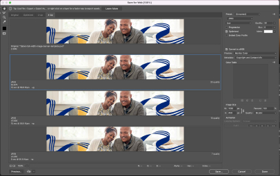
Create your image at 2x in Photoshop. And then go to File > Export > Save for Web (Legacy)
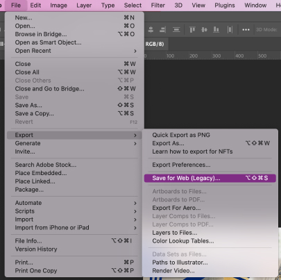
Select JPEG, Enter Quality: 20. Hit Save.
File naming convention best practices
When naming photography always include
- descriptive information about what page the image is on and what is in the image
- the word "mobile" or "tablet" at the end of the file name if the image is viewport specific
- use the word "full" at the end of the file name if the image is intended for use on the hero banner or full-width image component
- image dimensions
- separate words by dashes (not underscores)
- full words
- lowercase
File name examples
- image-descriptor-size-mobile.jpg
- empowering-dad-daughter-500x200.jpg
- empowering-health-dad-daughter-500x100-mobile.jpg
File names should not have any spaces or capital letters.